From Serif to Sans Serif, Italic to Bold — Fonts Speak Subconsciously to Customers
It’s not merely what you say, or how you say it. It’s also how it looks.
I’m talking about font selection. It might not immediately seem like something that could affect your bottom line, but choosing the right fonts is a way to draw a customer in or drive them away.
Whether you’re selling wine bearing beautiful labels, a restaurateur designing a menu or a burgeoning company introducing its first food product — you educate and connect with customers through words. And, how those words look matters.
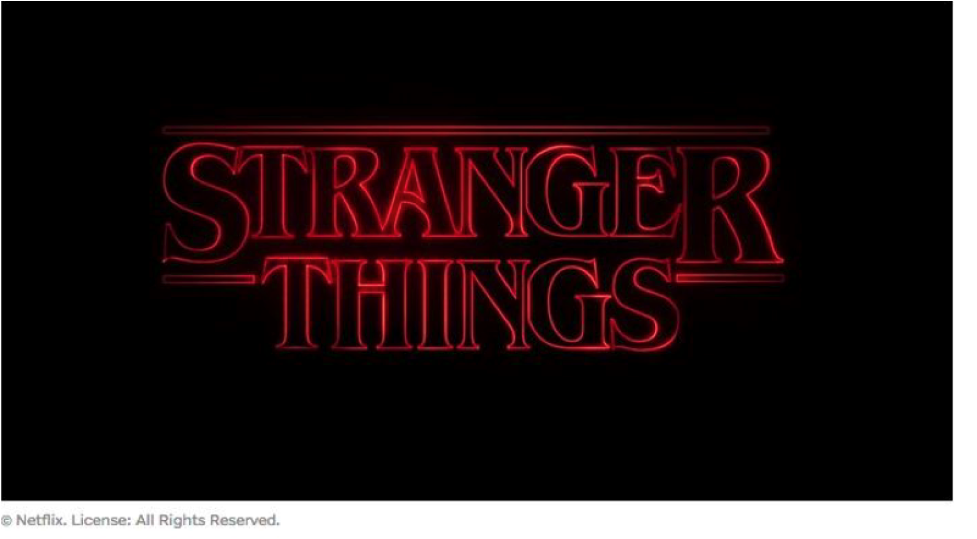
Last year, Netflix debuted an eight-episode, original television series called Stranger Things. It became an instant success. According to Business Insider, the show had more than eight million viewers in the first 16 days alone.

Yes, the Sci-Fi drama has a great cast and a dramatic, edge-of-your-seat plot. But many analysts agree that viewers became captivated in the first 50 seconds, during the main title sequence. They believe it was the typography in the credits that initially drew people in. The show created the Stranger Things logo —a blend of Benguiat and Avant Garde fonts with red neon as the coloring on a black background — based largely off of the fonts used on Stephen King’s paperback book covers from decades ago. The credits made anyone over the age of 30 feel instantly nostalgic, and subconsciously, the show spoke to them before the actors even appeared on stage.
Looking at the food and beverage industry specifically, let’s take Coca-Cola as an example.

When you look at the logo, you think it’s been that way forever – heavily scripted with letters that unspool into one another. But the truth is, the company has changed its famous logo seven times. They roughly stay within those parameters because it feels classic. Slightly tilted with bright white on red, there’s a pop in the color and a youth and energy in the loops.
Even when they refresh it every few years, the feeling is retained.
Here are some guidelines for choosing your fonts:
Consider Your Target Audience
Keeping your target audience in mind from the beginning is key in the overall effectiveness of your design. It’s a necessary practice to define brand personality traits before diving into selecting fonts. Sit down and consider your product, website, signage and marketing collateral. What is the philosophy and mission behind your business?
Are you designing a menu for a formal restaurant with candlelight, a lengthy wine list and a higher than average check cost? Bubbly, youthful fonts full of curves and visual action will not communicate the elegant experience your business offers. On the other hand, if you are a wine producer marketing to a younger demographic, something energetic makes sense.
Simplify the Options
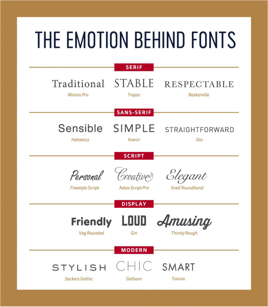
If you feel overwhelmed when researching fonts online, that’s completely understandable. There’s a staggering amount of choices. Cut through the clutter by grouping a few and attaching an adjective to each font, based on how it makes you feel. Here’s a handy cheat sheet created, to make it a little easier.

Notice the options under “Modern” look modern. The space between the letters is greater, just as a modern design in a room is uncluttered. The letters all line up exactly on the top and the bottom. They have a certain softness to them, but not too much. It’s barely perceptible. The lettering and spacing of these particular font types convey something youthful and even hipster, but also organized, clean and concise.
Now look at Display. The curve of the cursive in amusing gives you a whimsical feeling. It’s not an italic script — which often can lend a sense of something antiquated or even prudish. But, rather a tiny, cute cursive. The font replicates the type of personality or humorous situation that you might describe as amusing.
Garner Feedback
How you personally perceive a font may be different than what others see. So, it’s wise to get feedback. If your budget is limited, look to family, friends, mentors and business colleagues — as many different types of people as possible. We recommend working with an experienced graphic designer who is familiar with all aspects of font selection. Better yet, choose an advertising agency with a team of graphic designers. Depending on your needs, they can provide focus groups, design research and competitive analysis to ensure the fonts you select are sending the right message.

Jeremy Ballard
Director of Design