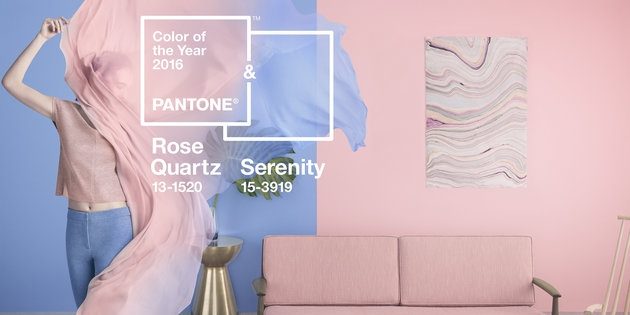
Pantone 2016 Color of the Year
For the first time Pantone has chosen two colors to represent the year, and 2016’s are Rose Quartz and Serenity.
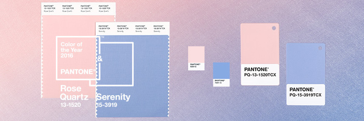
Rose Quartz and Serenity
Or to those outside the design world, baby pink and baby blue. We’ve seen loud, vibrant colors for most of their selections, but this year sees pastel, silvery hues.
We sat down with our design team to get professional opinions on the selection. “It’s like we’re having twins, woo!” said Designer Anna, who coincidentally had a set of boy and girl twins last year.
A likely reaction of many to the colors, our designers agreed they were nice together, but they were very soft and childlike, reminding them of babies and nurseries.
Designer Matt liked the colors and noted it seemed as if Pantone was hoping to promote a feeling of innocence and safety “with all of the drama going on in the world right now.”
According to Pantone’s own people, this was definitely a factor. Leatrice Eiseman, executive director of Pantone’s Color Institute said that the two colors “create a balance in a chaotic world,” and “induce feelings of stability, constancy, comfort and relaxation.”
Senior designer Luis’ take on the selection was, especially when used together, they “bring you back home.”
…And also that he’s had a shirt with these two Pantone colors of the year since high school. Usually the Pantone Color of the Year predicts or influences the upcoming color, but these two are definitely ones we’ve seen before and paired together frequently.
As for choosing two instead of one— that’s a business move. Many people with design influence pay close attention to these selections, so you will likely see them start to pop up in any number of industries from fashion to housewares and other product design. Two colors just means double the opportunity. They write the rules on this, so there’s no reason they wouldn’t pick three or five if a case could be made.